
Apomedical redesign
Apomeds is a modern online pharmacy with a focus on supporting lifestyle treatments and private prescriptions. Our Dutch mail order pharmacy is responsible for offering medicines and medical devices on our portal. If you choose the online prescription option, you can use a partner online doctor service, if it is available to you, or use other telepharmaceutical services.
My role
Research, UX/UI design
Timeline
Sep - Feb 2024
Tools
Hotjar, Figma
Introduction
During my time as Design team lead in Apomedical I have been responsible for increasing conversions through improved user experience. My first task was to find the drop points and issues during the flow and suggest solutions. The main business goal was to improve conversion so I started my investigation with the "Checkout" flow .
The problem
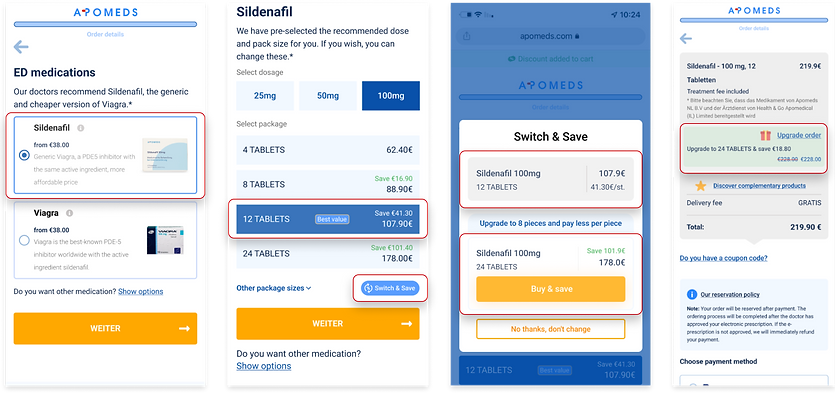
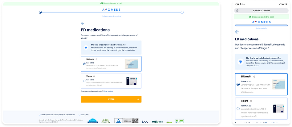
Apomeds main focus is on Erectile dysfunction medications, Currently the user will go through a questionnaire regarding his health and medical history, if applicable he will get to the product screen to choose his medication, prices can only be shown after selecting the dosage and package in the next screen. The user can continue with the pre-selected product and modification or change it, after selecting he will get to the shipping screen to provide details and select method. The payment page present a summary of the charges, including the treatment fee and coupons if applied, and multiple payment method options.
The current user journey creates a lot of possible drop points, particularly on the check out flow, giving the inconsistent visuals, the multiple steps and lack of trust elements.
Current design - Check out flow
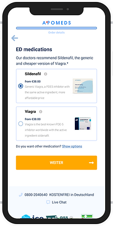
Product page
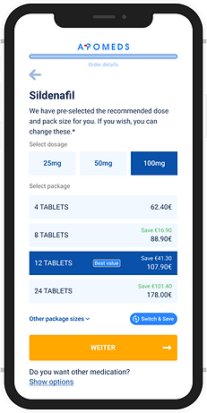
Modification page
When finishing a questionnaire, if eligible, the user reach the product screen to select the medication brand, the prices are from the minimum dosage and smallest package available for this medication, and the modification screen show prices per package.
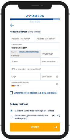
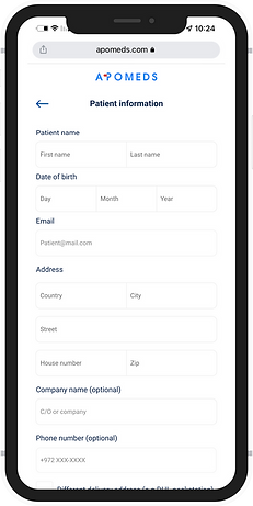
Shipping page
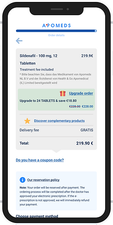
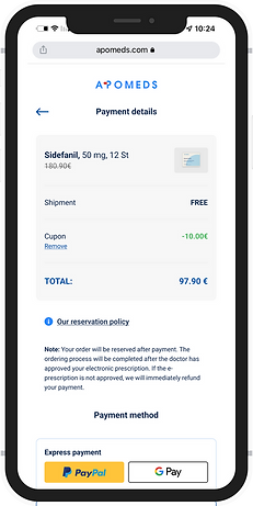
Payment page
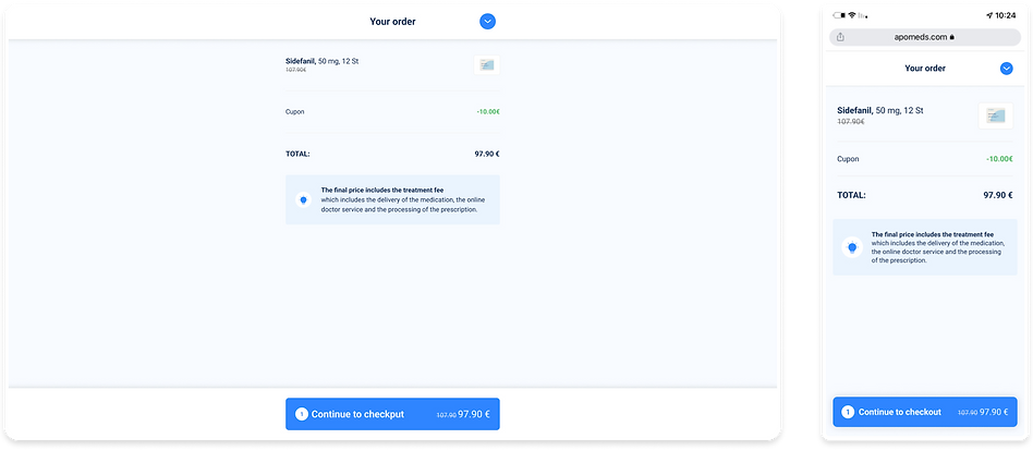
The next step is to enter you address details and select shipping method. Lastly you get to the payment page to see a summary of your order, only then you the treatment fee and discounts applied, and choose your payment method.
Process
I’m a methodic person and always tries to follow the process step by step, even if I think I know already the users and needs - I feel it is important to ask my self the questions and have a defined task flow and scope before getting into the ideation part.
Discover
I started with data collecting, using our CMS and analytics I gathered all statistics about the users behaviours.
My next step was to list all questions I could think of about my users and about the product. I wanted to understand why things were the way they were and the thinking process that led to it,
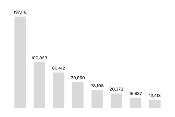
We had a 48.84% drop in the first step, and only 8.44% of the users completed the purchase.
After grasping the existing design and its limitations, I began watching recordings and mapping the users pain points and needs, I used Hotjar heat maps and funnel features to see rage and error clicks, common behaviour and missed opportunities.

The most clicked button in modification screen is the “Back” button on top.
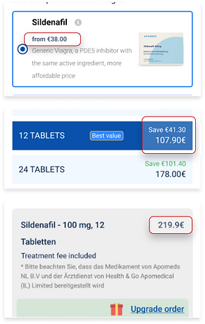
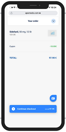
The total price shown only on payment screen
.png)
Inconsistent design and behaviour
I embarked on a journey of iterative improvements, collaborating closely with the team for feedback. While I was initially guided to make only minimal adjustments, the team soon realized the transformative potential of the new designs and became open to exploring these broader enhancements.
We used the Imapct - Effort method to determine our scope for MVP, and for post MVP.
.png)
Design
The design timeline divided to 2 parts, MVP and Post MVP, depending the post MVP scope on the results of the MVP test.
MVP
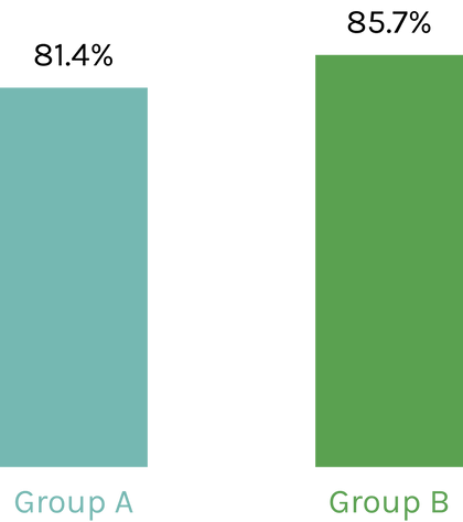
We decided to AB test the sticky cart first, considering this is the feature that we believed in the most and had a solution for most of our users critical pain points.
Product screen
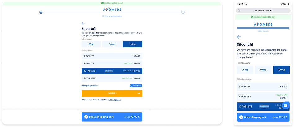
Modification screen
Order screen
RESULTS
The test proved a slight improvement in conversion between group A with the current design, and group B with the new sticky cart. We only tested the cart on a small group of users, for 2 weeks.
UI Elements redesign

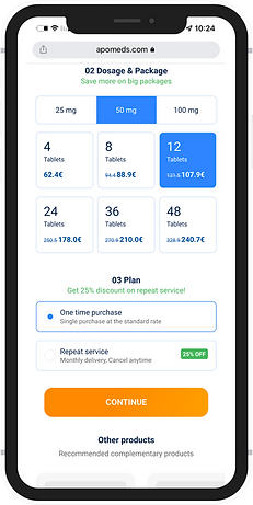

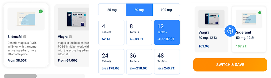
We united the product and modification, unified the UI elements design and added steps and titles. By the time we were ready the business already decided to try sell subscriptions with massive promotion discount, this feature was added to the final design as well.