
Worthy "Ship back" case study
Worthy is an online auction house that sells second hand diamond and luxury jewelries. The product deals with both types of users - the sellers and the buyers. We have a web app to register a new jewellery with questionnaire that uses algorithm to remove the submissions we can’t sell (too cheap, fake, not a real user etc.) and we have a buyers platform showcasing all jewelries and runs auctions online.
My role
UX research, product design
Timeline
Apr 22 - Feb 23
Tools
Looker, Full story, Figma, Usertesting.com
Introduction
As part of my job as Product designer in Worthy I spent time exploring the reviews and locate user issues to improve experience. When I started in Worthy the reviews were not been monitored, we had one person that was responsible for all users complains and reviews and she would go through the review websites one by one to see what is written about us. i created a Looker dashboard with the data team and started to analyse segments and returning complains.
The problem
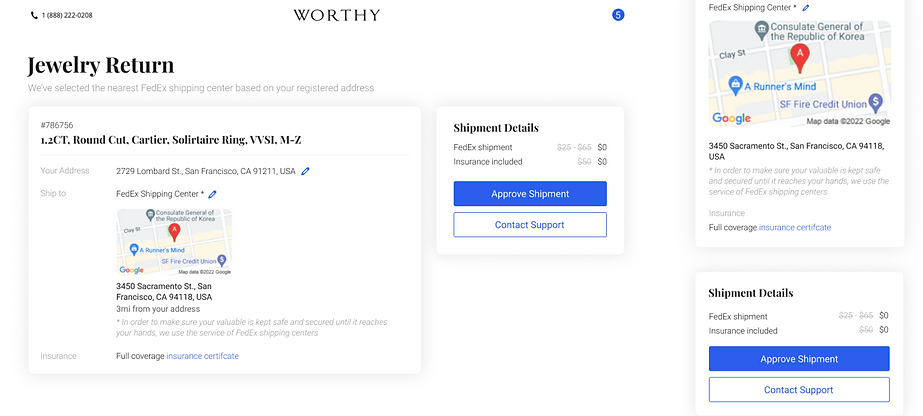
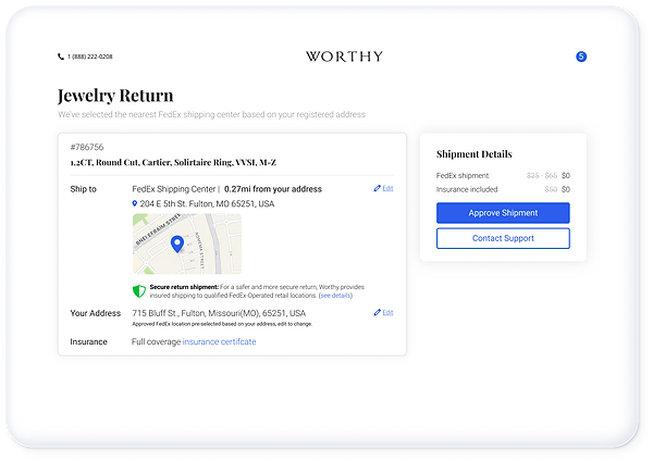
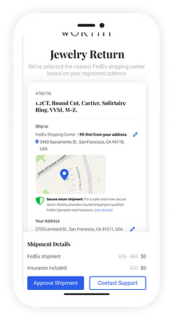
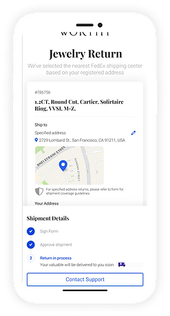
When a “Seller” that already sent her jewellery to our labs changes her mind and request to cancel the auction, the jewellery needs to be sent back to the user. This screen called ship-back and when a user cancelled the process this will be the screen that appears when login to his profile. The user must approve the shipping address and the shipping method. From users complains on the review websites we found out that the users often approve the ship back request without reading the details. Our ship back service is through fedex and the default method selected in this screen is to ship the jewlerry to a Fedex shipping center.
Current design - Ship back screen
Process
My method was to collect all the reviews that were mentioning this issue, create a dashboard in Looker to collect data about the ship-back screen with the help of the data team and suggest “Easy fixes” to improve the user experience based on the recordings and the pain points that were found.
Discover
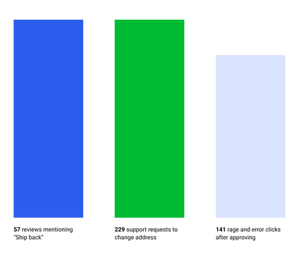
The reviews investigation produced 168 mentions of the ship back issue in the past 3 months.
The amount of users that visited the Ship - back screen in those 3 months was 1,413.
Tableau reports
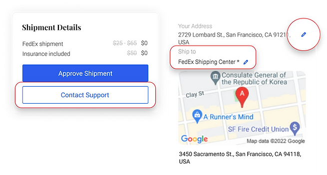
“Contact support” button was clicked 672 times on this screen.
93% of the requests was to change the shipping address or method, without noticing it can be done on the screen.
61% of the mobile users that clicked “Approve shipment” spent less than 1.6 seconds on the screen before approving.
69% of the desktop users that clicked “approve shipment” spent less than 1.4 seconds on the screen before approving.
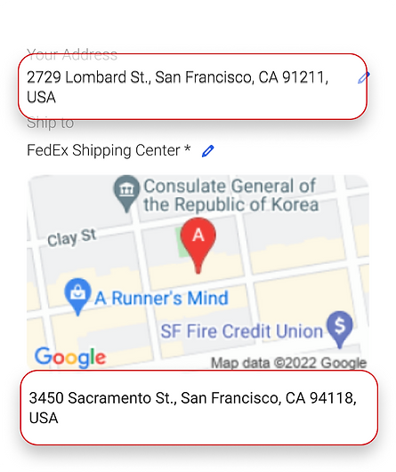
91 of the 168 users that gave bed review and mentioned this issue confirmed they did not understand that the address below the map is the shipment destiny.

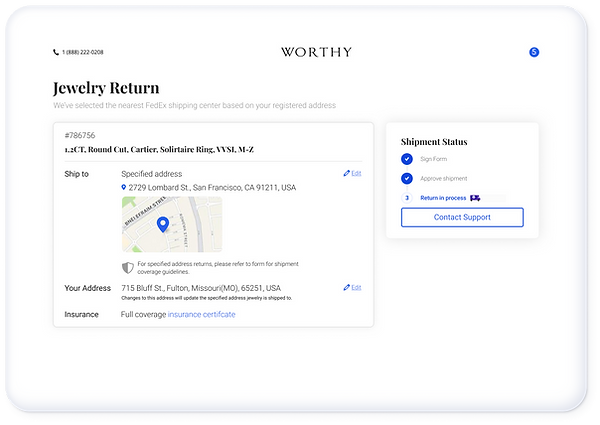
82% of the rage and error clicks are after approving the shipment, there is no indication to what happens next or any success message to confirm the shipment is in process. The only change in the screen is that the button of approving shipment is gone.
After mapping the pain points and discussing with the team to understand the decision making process, we defined the scope of changes that can be made and the business goals for this screen.
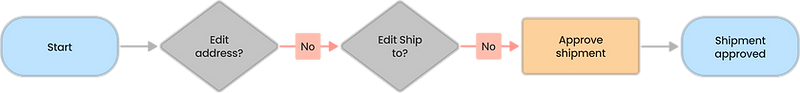
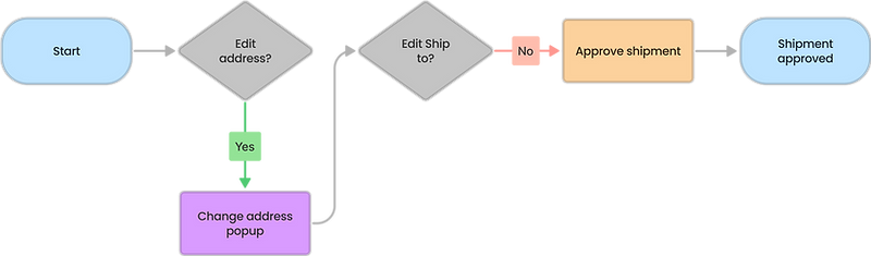
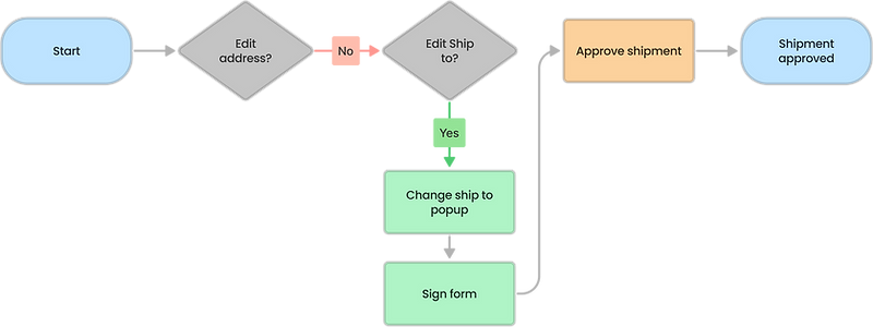
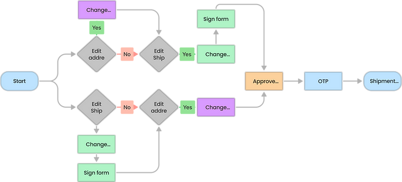
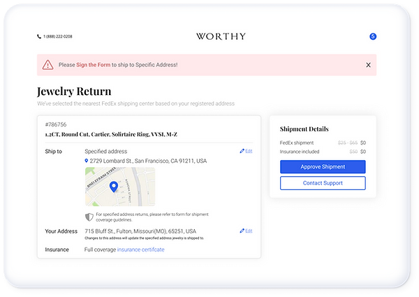
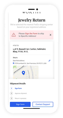
My next step was to suggest a design that will support the goals and improve the user experience by answering the pain points we detected. I created the user flow and the use cases I will have to consider, and listed all design elements that will have to change.
Design
I started design and delivered a detailed prototype to test in usertesting. com, we created a question list and confirmed with the users they know where to look and that they understand the shipment process.
Results
UserTesting.com results were very positive and we launched the new design.
After a month from going live with the changes we checked the review dashboard and the stats were as following:
Month before
Month after
